U3163211, u3086001, u3114720
Analysing Topics and Subjects: Visualisation Methods.
One task our group has worked on is creating visualisations of the topic and subject data.
A simple method used was to simply run the topics and subject individually through Juypter to get a solid text block. We then took that text block and ran it through wordcounter.
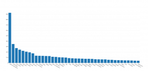
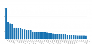
(https://www.databasic.io/en/wordcounter/#paste) Wordcounter allows us to apply filters and examine the text. After applying the filters we were left with three categories: single word list, bigrams and trigrams. These new, cleaned data sets can then be put through visualisation programs such as Plot.ly (https://plot.ly/#/) to create simple graphs that can used to compare and contrast the data.
In the examples shown there is already an interesting contrast. Although “Demonstrations” is by far the most used single word in the data this is not consistent across our other lists. In Trigrams, for example, the most prominent series is “Aboriginal Peoples Australia”.
If we examine that Trigram, I believe there are several reasons for its recurrence. Initially I assumed the prominents of this phrase was due to social issues of the 1960s and 1970s. Were this the case I would expect the majority of the records to be photos of protests and demonstrations. Instead what we found was more complicated than that.
In reality the prevalence of these terms is due to a combination of historical notations and contemporaneous activism. At the same time as the archive addressed contemporaneous issues and discussions an impressive collection of settler drawings of Aboriginal Australians going about their day to day lives and 19th century breastplate regalia.
And that brings us to a second task we were given, linking this data to the collection. The paths we take to connect our cleaned data to the collection must be informed by its potential use. For example the issue with our Trigram could be managed by examining the time periods these records come from. In order to solve this problem we needed a way to connect topics and dates.
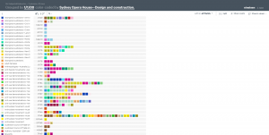
A method we are currently exploring and fine tuning is running the data through a website called Nineteen (http://usenineteen.com/) . With Nineteen we can visualise our data as we isolate individual series from the raw data.
In the example below, the Subject and start dates have been isolated from the rest of the raw data and run through this program.

Although it might be a little hard to see and visually cluttered, Nineteen has helped us. It has essentially grouped the Subject into their collective years, so you can see when subjects were most prominently used.
Our current issues with this method are ease of interface and prioritisation of tag linking. Community input as to what tags would make this tool the most useful to browsing parties. For example what tags would you be most interested in perusing?
Our next step is to further condense our topic list and eliminate duplicate and similar topics. As you can see there are a lot of similar topics that should be condensed and we are currently looking at ways to create a standard set of topics and apply them across the collection. To complicate that splitting the data in a way that does not lose information is a narrow path to walk.
In case photos don’t turn out very well links here
https://plot.ly/create/?share_key=vOTFauNdSFLmCeEywYOMvu&fid=PeterGrimm%3A5
https://plot.ly/create/?fid=PeterGrimm%3A7#/
https://plot.ly/create/?fid=PeterGrimm%3A9


