Finding the Faces of the Tribune

The final stage of the Machine Tagging and Computer Vision group’s investigations looked at the potential of implementing basic facial detection technology (in this case, using OpenCV) to the Tribune collection in an effort to determine alternative methods for users to discover and navigate this extensive resource. While our group was not responsible for the technical aspects of this experiment, we were involved in interpreting the resulting data and attempting to identify where there might be advantages to utilising this approach.

While initially considering the possibilities of this option limited, we soon discovered that that even simply finding faces in the Tribune collection could prove extremely valuable. This approach had the potential to not only distinguish the photographs with people from those without, but also possibly reveal a bit about the nature of a particular image by the number of faces it contains.

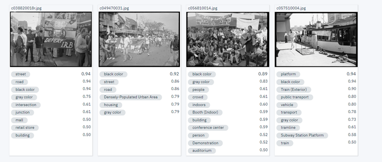
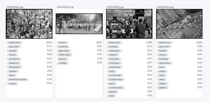
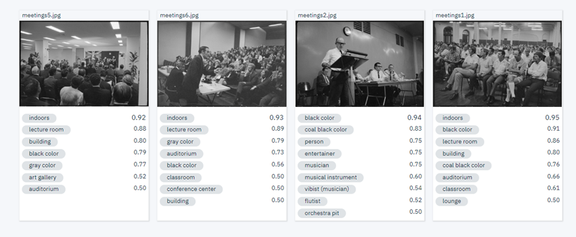
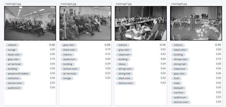
Although not guaranteed to pick up on every single face, and with varying accuracy across the many different images, the ability of facial detection to return an approximate number could prove useful in determining the likelihood of a photograph being of an individual or a crowd. Such information could be very useful in this particular case, and provide another path for people searching the Tribune images. The option to only show those with, for instance, more than 10 or 20 faces could direct users to photographs of protests or meetings – and there may well be other ways of using the resulting data to assist people through the collection.

Exploring the data generated from this experiment gives us the opportunity to see an overview of faces in the collection, revealing how many images in total were reported to contain faces, as well as the average number of faces per image and a chart demonstrating face frequency across the 60,000 Tribune photographs. Additionally, listing those images with a face count that exceeds 100, making it possible to zoom in on them to see exactly what they’re about.

Of course, it’s important to consider that the ‘face’ being identified may not always be a face…

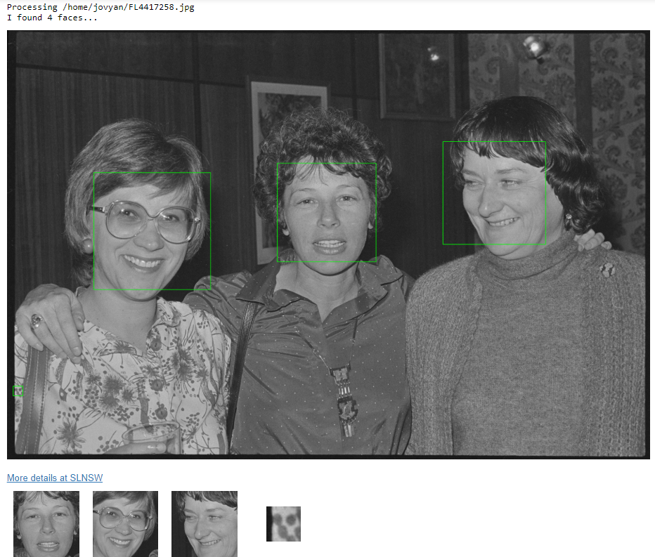
In this case, a group portrait of 3 individuals supposedly contains 4 faces, with the computer picking up on something that merely resembles a face in a pattern (something we noticed happening quite frequently). False positives such as these are inevitable and can certainly be filtered out in order to ensure more accurate results, although it’s actually quite interesting to see what mistakes are being made, and consider how the facial detection technology is making its decisions.

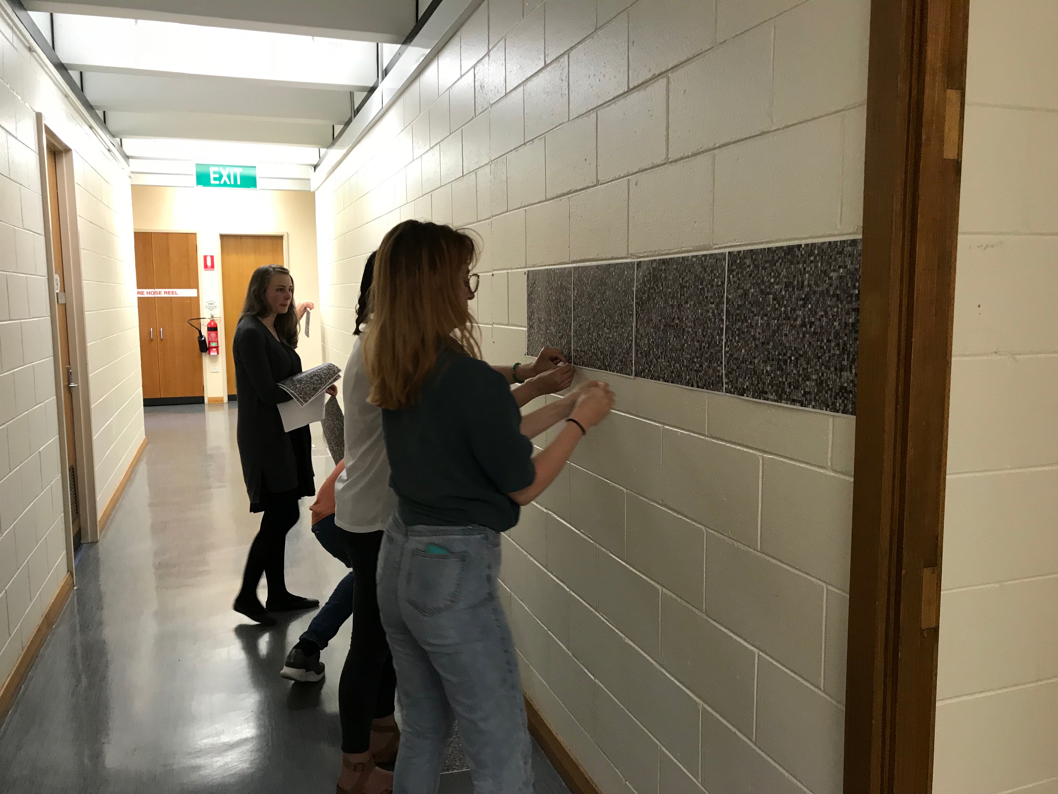
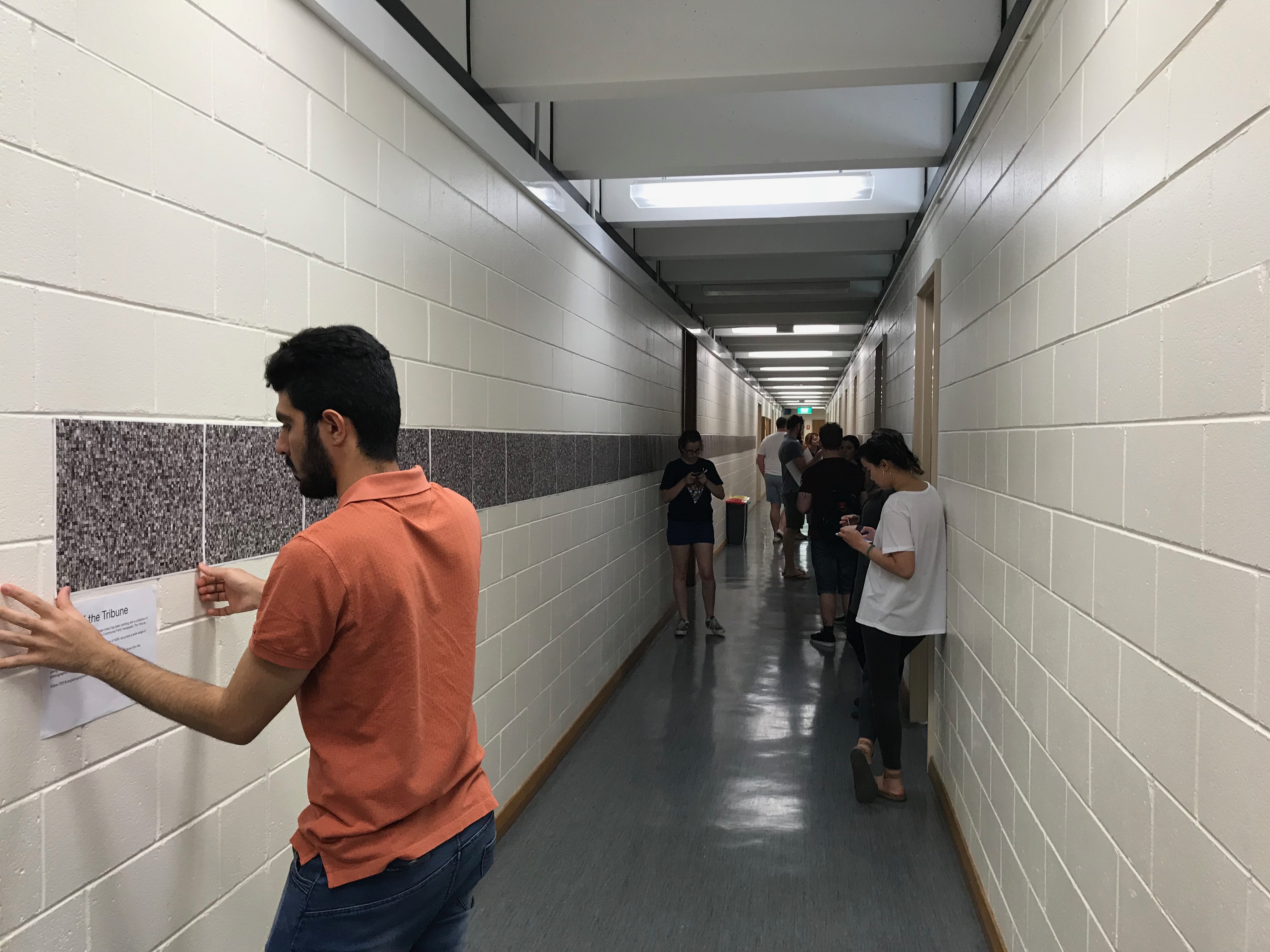
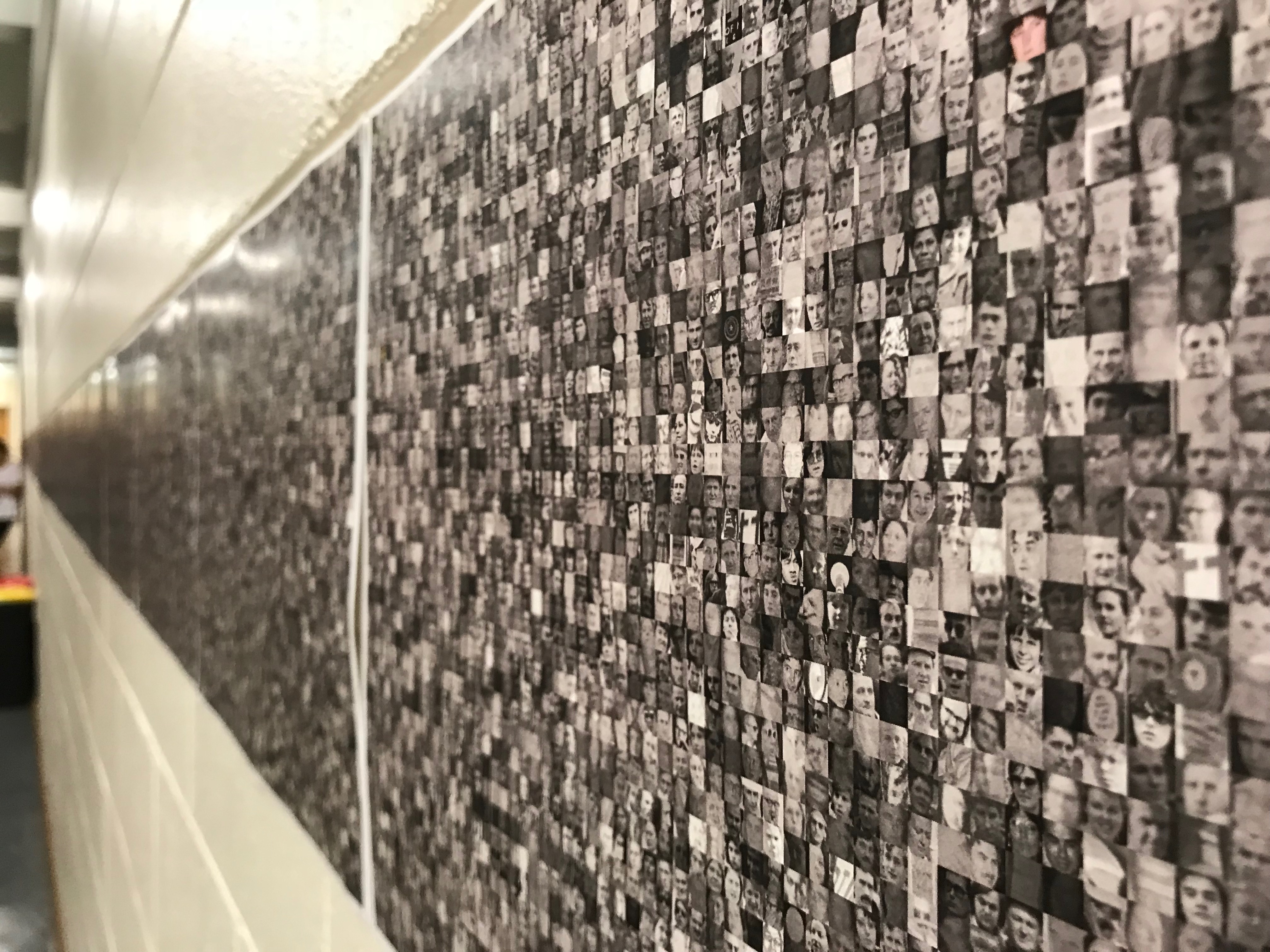
In all, 230,677 ‘faces’ were detected, and this experiment demonstrated a few creative ways of using them – by extracting them from their context and making them the focus. Some interesting things resulted from focusing on faces of the Tribune collection. In this case, the cropped versions of each identified face became part of a single, enormous image – which can be viewed in detail here.

Another approach involves randomly selecting a photograph from the Tribune collection which has been determined to contain more than 20 faces, and from it, generating a different version of the detected faces in isolation. It’s then capable of a demonstrating a transition between the two images.

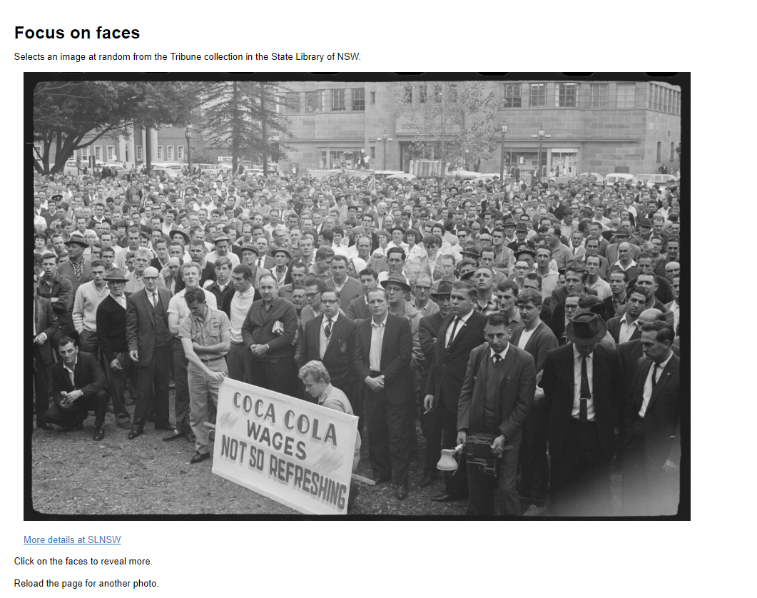
Faces have the power to really draw people in – initially isolating them from their context, its then possible to add the context back in order to see what’s actually going on in a photograph. From what we’ve seen, these approaches could prove to be an extremely effective and engaging way of presenting the Tribune collection.

As noted with our previous experiment, it’s possible to see the potential of basic facial detection even in its unpolished, preliminary form. Even such a simple process as this may provide opportunities for extracting useful metadata, and so could prove an effective means of enriching the collection, as well as opening it up for people to find and experience this resource based solely on the properties of the images themselves.

(If you’re interested, the facial detection notebook for this experiment can be found and tested out here).

Training a Classification Model for the Tribune Collection

While the initial testing phase undertaken by the Machine Tagging and Computer Vision group (outlined in our previous posts) provided some useful insights into what these systems are capable of, it really only affirmed our perspective that, in order to gain applicable results with a certain level of consistency, it would be necessary to train a custom machine learning model specifically on the Tribune photographs. Although available, this option wasn’t open to us through the services we’d tested. However, we did get the opportunity to see how it might work through the use of TensorFlow – an open source machine learning framework.

We were only able to get through the preliminary stages of this experiment, and required great deal of assistance – the ‘TensorFlow for poets’ example was followed and the group compiled a very small training set to see how it might distinguish between images of protests and portraits. Once trained, we were able to see how the classifier model responded to photographs drawn at random from the Tribune collection. Despite the limited training set the results seemed surprisingly accurate in many cases…

However, there were still some incorrect interpretations – even when the images might seem, to us, quite straightforward…

Obviously, given the limited scope of the training set, there would be instances where the photograph being fed through hadn’t been accounted for in the categories we’d chosen.
Although neither, in this case the photograph is considered more likely to be an image of a protest than a portrait, and receives a fairly high confidence score as well. Such instances give us the chance to speculate about what is actually being ‘seen’ and how things might actually be working. What elements are being used to distinguish a protest photograph from a portrait? Number or absence of people, perhaps? or certain lines or shapes? There’s no doubt likely to be many contributing factors, and of course entirely dependant on the quality and scope of the training set being used.

Simply being able to assign all the photographs into pre-defined categories would of course be valuable, and we could see many advantages of relying on computer vision for this particular task, although it may be possible to take it even further.

One intriguing possibility we discussed is that image recognition might be capable of identifying the signs specific to protest photographs (although I’m not confident that’s the case for the above example, but it’s possible…). If so, it would present the opportunity to find and focus in on the protest signs of the Tribune, bring them all together to provide users with a more specific point from which to search the collection. Additionally, there may be other approaches to organising the collection that image recognition could assist with, such as by quality or dimensions – there are many possibilities that could be considered and explored further.

The last step of this experiment was to run the classification model across the entire collection of 60,000 Tribune photographs in order to determine its overall accuracy, and whether the confidence scores provided could be used in refining the results. This intensive process wasn’t completed before the project wrapped up, so unfortunately we can’t be certain of the full picture, but from what we’ve seen there’s clearly promise here.

(If you’re interested, the notebook can be found and the classification model tested out further here).

IBM Watson Machine Tagging! (freeware)

First a quick brief on what this is all about:

This was a class project which aimed to investigate, develop, and report on a variety of techniques to visualise, analyse, and enrich metadata describing a collection of images from the State Library of NSW that document a wide range of political and social issues from the 1960s to the 1990s.

The class was divided into six groups, with the one I was part of looking at machine tagging and machine learning.

Our four group members were tasked with looking into machine learning software that is freely available online, so we each decided to play with one before coming back with our assessments.
This is mine.

I decided to look at an application provided by IBM: Watson.

IBM Watson is a visual recognition service available to be used by anyone. After having created an account with IBM on their website, a user can create a “Lite” account which translates to being given access to the free demo mode of different available applications from IBM.

You can find a tutorial on how to get started here: https://console.bluemix.net/docs/services/visual-recognition/getting-started.html#getting-started-tutorial

An interesting capability here is the chance to create a custom model, which I did not. I opted for going with the general model available, as my team-mates would also be using the standard or general models available through the applications which they were testing. (Also, creating a custom model would be quite time consuming and advanced).

Running a test set of 32 images sourced from the State Library of New South Wales’ collection of Tribune negatives to see what kind of tags it would produce proved very easy, as multiple images were able to be uploaded into the application at a time.
We had decided to split the 32 images into sets of 8 pertaining to four categories:

  • Portraits
  • Protests
  • Meetings
  • Miscellaneous

Let it be noted that each member of the group used the same test set, so we could then compare our results.
The following images are screen-captures of IBM Watson’s results.

Portraits:

Protests:

Meetings:

Miscellaneous:

At first I was a little disappointed but not surprised that there were so many inaccuracies in regards to the tags that Watson had provided.
However, as can be seen, there are also many accurate tags. The ability the application has to identify crowds, people, buildings, roads, auditoriums, lecture rooms, as well as polo is quite impressive.

There are definitely uses for this machine tagging software. A human sorting through a set of 60 000 images would be time consuming to say the least. The capability to sort and classify images, to detect faces and people has a definite potential in reducing the time and effort spent by a human in that task.

As a final note, creating a custom model might be an interesting step to take beyond the one I have undertaken, also perhaps applying some facial recognition applications to the faces detected may have uses as well. For example finding people of note, such as politicians and protest leaders throughout the already detected faces.

Overall, the free application provided by IBM was easy to use and gets a tick from me. How does it compare with the applications used by my team-mates? Well, just check the reviews they’ve uploaded to this blog, and decide for yourself. Have a play, they’re free!

Analyzing Topics and Subjects

Peter Grimmett – u3163211

Martin Ruckschloss – U3114720

Issues encountered with data:

One major problem we had with the data was that words were being grouped together in phrases such as “Aboriginal Australians”. This was problematic for some aspects of visualisation, as if we wanted to see the frequency of the term “Australians” the phrase “Aboriginal Australians” would not be included in this count. To solve this, a modification of the Jupyter notebook was necessary to split words by the spaces in between them. The result was a more workable data set in which we could conduct further analysis into the nature of the data.

Another major issue with the data set is that a large amount of the collection has unique words or phrases as their identifiers. The sheer vastness of the data set we were working with became apparent. When split into single words the the statistical issues of the collection are as follows:

Descriptions:

-6,600 unique words used

-There are approximately 3,080 words with a count of 1. (46.6% of descriptions)

-There are 1,170 single words in the description count with a count of 2. (17.7% of descriptions)

-2,010 with frequency counts ranging from 3 to 20 (30% of descriptions)

Places:

-282 unique words used

-188 places with a count of 1-2 (66.6%)

Topics:

-845 unique words used

-482 topics with a count of 1-2 (57%)

-243 topics with a count of 3-10 (28%)

Titles:

-3000 unique words used

-2327 with a count from 1-3 (77%)

As can be seen from some of the above statistics, a majority of the data from the collection has very unique terms used in the titles, descriptions, places and topic fields. Such data is difficult to visualize due to there being no further relations between the data and no categories to further group data together into.

One solution is to disregard or filter away terms with little to no use and only visualize terms with high counts. An example of this may be to not graph any result with a count of less than 20. Another method utilized was to graph the first segment of results with high usage counts, then separately graph the lesser used terms. The resulting visualizations from such filtering were much more meaningful to the viewer.

Visualization:

Upon testing various methods of visualization and graphs, we found the the single best method of visualization was a basic bar chart with the X-axis containing phrases or words and the Y axis measuring the frequency. As stated above, various different filtering methods were applied in attempts to make the visualization more meaningful. The results are as follows:

https://drive.google.com/open?id=1fOa4mYCYi3QjEHlTV_M0ALsJxKdJCyLodqLVefwxKlU

Word clouds:

Another useful method of visualization we explored were word clouds. Similar filtration methods were used as in the bar charts, taking various sizes and applying them to the word cloud.

https://drive.google.com/open?id=1iMpNghu_cQ4Sm9UDCnNfjveQWhQutNxuEOvp9myq0LQ

further Analysis of data:

The following graph is a good indicator of the disproportional spread of topics and just how vast that list is. The numbers on the bottom indicate how many times a word appears in the collection. So the bar labeled “5” means there are 28 words in the collection that each appear only five times throughout the collection.
With 351 unique topics, that is topics that only have one use in the collection, that totals nearly half of cleaned topic count.
However, of of the total 8624 words, 98-926 makes up the largest portion, consisting of 3670 words even though it only consists of 17 unique topics. (Where 1 only consists of 351, as they are only single use).

https://drive.google.com/open?id=11954aDiG5ii7vYJ60K4RpdpPu04sRhqdi46rdHIJfFo

These links should provide a more interactive look at both the topics list and subjects list.
https://plot.ly/~PeterGrimm/13/

Topics split by count

https://plot.ly/~PeterGrimm/15/

Subjects split by count


Analysis Topics & Subjects

U3163211, u3086001, u3114720
Analysing Topics and Subjects: Visualisation Methods.


One task our group has worked on is creating visualisations of the topic and subject data.


A simple method used was to simply run the topics and subject individually through Juypter to get a solid text block. We then took that text block and ran it through wordcounter.

(https://www.databasic.io/en/wordcounter/#paste) Wordcounter allows us to apply filters and examine the text. After applying the filters we were left with three categories: single word list, bigrams and trigrams. These new, cleaned data sets can then be put through visualisation programs such as Plot.ly (​https://plot.ly/#/) to create simple graphs that can used to compare and contrast the data.

In the examples shown there is already an interesting contrast. Although “Demonstrations” is by far the most used single word in the data this is not consistent across our other lists. In Trigrams, for example, the most prominent series is “Aboriginal Peoples Australia”.

If we examine that Trigram, I believe there are several reasons for its recurrence. Initially I assumed the prominents of this phrase was due to social issues of the 1960s and 1970s. Were this the case I would expect the majority of the records to be photos of protests and demonstrations. Instead what we found was more complicated than that.

In reality the prevalence of these terms is due to a combination of historical notations and contemporaneous activism. At the same time as the archive addressed contemporaneous issues and discussions an impressive collection of settler drawings of Aboriginal Australians going about their day to day lives and 19th century breastplate regalia.


And that brings us to a second task we were given, linking this data to the collection. The paths we take to connect our cleaned data to the collection must be informed by its potential use. For example the issue with our Trigram could be managed by examining the time periods these records come from. In order to solve this problem we needed a way to connect topics and dates.


A method we are currently exploring and fine tuning is running the data through a website called Nineteen (http://usenineteen.com/)​ . With Nineteen we can visualise our data as we isolate individual series from the raw data.

In the example below, the Subject and start dates have been isolated from the rest of the raw data and run through this program.

Although it might be a little hard to see and visually cluttered, Nineteen has helped us. It has essentially grouped the Subject into their collective years, so you can see when subjects were most prominently used.


Our current issues with this method are ease of interface and prioritisation of tag linking. Community input as to what tags would make this tool the most useful to browsing parties. For example what tags would you be most interested in perusing?


Our next step is to further condense our topic list and eliminate duplicate and similar topics. As you can see there are a lot of similar topics that should be condensed and we are currently looking at ways to create a standard set of topics and apply them across the collection. To complicate that splitting the data in a way that does not lose information is a narrow path to walk.

In case photos don’t turn out very well links here
https://plot.ly/create/?share_key=vOTFauNdSFLmCeEywYOMvu&fid=PeterGrimm%3A5

https://plot.ly/create/?fid=PeterGrimm%3A7#/

https://plot.ly/create/?fid=PeterGrimm%3A9

Making Connections – Standardized method of Linking

Searching on TROVE
Searching based on these given parameters for the Trove website yielded no results. Other attempts did not work either when searching for Photographs

Searching for both Newspaper AND Pictures through the Trove API console
Search Query: q=The+Tribune&zone=newspaper,picture&encoding=json&n=20
Full Link: http://api.trove.nla.gov.au/result?q=The+Tribune&zone=newspaper,picture&encoding=json&n=20
Red = the status of each particular zone
Blue = the results associated with the blue (the actual newspapers/pictures)
Photo of Picture results (in the Zone key identifier under name: Pictures)

Photo of Newspaper results (in the Zone key identifier under name:Pictures)

The questions given in this task where vague, ill justify my interpretation of the questions to this solution given above.
1. Investigate ways to identify photographs that where published in the Tribune
• there is no fully guaranteed way I thought of to give a result containing photo results 100% from The Tribune’s own articles. However I propose that querying based of off the “isPartOf” key identifier with “The Tribune” Could bring more consistent results.
• Ive concluded that I couldn’t find a possible way, but there may be other solutions that where not considered. If there are not, im assuming the way trove tags these database entries or the actual algorithm, are not as efficient as they could be when searching photographs
2. Develop a Standardized me

For the 3rd question

Adding comments and tags

Links to my search through:
https://trove.nla.gov.au/work/21467356?q=%28The+Tribune%29+%28nuc%3A%22NSL%22%29&c=article
https://trove.nla.gov.au/picture/result?q=(The%20Tribune)%20(nuc%3A%22NSL%22)
https://trove.nla.gov.au/work/170588296?q=%28The+Tribune%29+%28nuc%3A%22NSL%22%29&c=picture&versionId=185989014

Making Connections:

One of the tasks for our group Making Connections was to look into the coverage of the Tribune and how it covers particular events and topics. Below I’ll be talking about just a couple of the events covered by the Tribune.

Using Trove searches I was able to see the amount of articles created by the Tribune, particularly articles on Vietnam. Looking at the trove searches helped me to find out that the tribune had a total of 2,142 digitized newspapers during the period of 1970-1979. In 1970 643 articles were found and it slowly dropped off over the years, in 1976 there was only 152 articles published by the tribune on Vietnam.

This change could be due to the end of the war in 1975 but it is interesting as there is still a fair amount of articles posted about Vietnam in the post war period. Of these 2,142 only 721 have photos according to Trove, this is interesting because there was a large amount of media presence in Vietnam but yet only 721 articles have photos.

Source: https://trove.nla.gov.au/newspaper/result?l-title=1002&l-decade=197&q=%22Vietnam%22&l-illustrated=true&l-illtype=Photo

Another interesting search topic is the anti-war demonstrations in this time. Looking at the 1,344 anti-war demonstrations articles published by the Tribune, 507 of them have photos.

These numbers are really good for the time and show the use of negatives in these papers and interestingly the largest number of articles with photos was in 1970, probably due to the fact that the war was still going and this had a massive impact on the amount of articles written about it.

Source: https://trove.nla.gov.au/newspaper/result?q=anti+war&exactPhrase&anyWords&notWords&requestHandler&dateFrom=1970-01-01&dateTo=1979-12-31&l-advtitle=1002&sortby&l-illustrated=true&l-category=Article

The coverage of these topics and events change over time due to the end of the war but also this thought that Vietnam was horrible idea and created a lot of unrest in the community. Seeing this war televised also had a big impact on the amount of articles written because it was on Television and people were seeing what was going on in this war everywhere.

Quick Review: Imagga’s Auto-Tagging API

The Machine Tagging and Computer Vision group started out by investigating the effectiveness of some available demo versions of automated tagging services, which meant relying on the default models that these services had been trained on and seeing whether or not they proved to be useful. We attempted to put together a fairly comprehensive test set of images from the State Library of New South Wales’ Tribune collection to run through four programs, one of which being Imagga, and note the results.

The Imagga API is described as a set of image understanding and analysis technologies available as a web service, allowing users to automate the process of analysing, organising and searching through large collections of unstructured images, which is an issue we’re trying to address as part of our class project.

Imagga provides reasonably thorough and easy to use demos which are accessible to the public without any sign-up requirements. They include options regarding the automated tagging, categorisation, colour extraction, cropping and content moderation of image collections. It should be noted that Imagga is lacking the facial detection component included in some of the other services we tested. For the purposes of this exercise, only the automated-tagging service was trialed.

Imagga’s Auto-Tagging demo
Imagga’s Auto-Tagging demo in practice.

Returned is a list of many automatically suggested tags (the exact number varies depending on the image) with a confidence percentage assigned to each. The tags generated may be an object, colour, concept, and so on. The results can be viewed in full here: Machine Tagging and Computer Vision – Imagga Results.

While the huge amount of tags may seem promising at first, a closer look at the suggestions reveals that there is a lot of repetition and conflict (both ‘city’ and ‘rural’,’ transportation’ and ‘transport’, ‘child’ and ‘adult’, ‘elderly’ and ‘old-timer’). Although Imagga doesn’t return as many of the more redundant and predictable tags that some of the other services generated, it’s going to the other extreme with some very obscure and specific results, which is interesting. Things such as ‘planetarium’, ‘shower cap’, ‘chemical’, ‘shoe shop’ for perfectly standard images of meetings. Protest images resulted in concepts such as ‘jigsaw puzzle’, ‘shopping cart’, ‘cobweb’ and ‘earthenware’ – often receiving a high confidence percentage. Ultimately, we can’t really know what is being ‘seen’ as the computer analyses the images, though I found myself wanting to know.

In many cases the results were wildly inaccurate, but Imagga seems capable to an extent (although the confidence percentages weren’t very useful). Although still not perfect, I’d say it’s more suited to portraits than any other category – but suggesting tags such as ‘attractive’, ‘sexy’, etc. to describe images of people could be considered slightly inappropriate, and it would do this in almost every case.

Even if these services are able to achieve accuracy, the main question to ask is whether or not the results would prove useful. Ultimately, we’re looking to see if any of the tags being generated could provide those searching the Tribune collection with some useful access points from which to do so. There’s a lot to pick over in this case, and there may well be useful tags within those supplied, but on the surface, things don’t look too hopeful. However, as Imagga explains – while it’s possible for these out-of-the-box models to suggest thousands of predefined tags, the potential of auto-tagging technology lies in its ability to be trained. Although, in order to take full advantage of Imagga’s services, including their customisable machine learning technologies, it is necessary to sign up and select an appropriate subscription plan.

Tracing protesters steps through Sydney in March 1966

Another of the Knightlab’s products the Events team have tested is ‘Storymap JS’.  Loading a selection of photo’s from the State Library of NSW’s Tribune collection into the Storymap program, we can trace the route taken by protesters in March 1966 from the Sydney Opera House to the State Parliament of NSW, annotating the photos along the route to complete the story.

Protesters march from Sydney Opera House construction site to State Parliament

The first slide of the Storymap provides room for source references and an introduction to the story.  We included links back to the Tribune articles from the day on Trove, and the State Library’s catalogue, so that the full set of photography from the day is easily available.

Storymap JS sets out a guide of a maximum 20 photos for a storyline.  Aspects of the production can be modified in Storymap such as font, colours, mapping style, etc., however, we chose to replicate the visuals used by our Mapping team in their earlier post.

css.php